PowerShelter, Outdoor Locker UI
A touchscreen for e-bike battery lockers, built for rain, wet fingers, and a hurry
Try the prototype
A working click-through of the real screens. Tap the highlighted control, click anywhere on the screen to move forward, or use the arrow keys. It runs the full unlock flow, from walking up to the locker to ending the session.


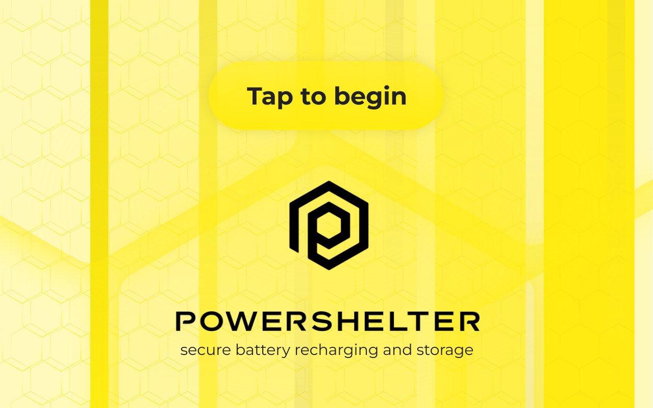
Walk up to the locker in the rain and tap to begin.
The Brief
PowerShelter BV runs outdoor lockers where people charge e-bike batteries. They needed one touchscreen a user could walk up to, get a compartment assignment, open it, drop the battery in to charge, and go.
The Constraint
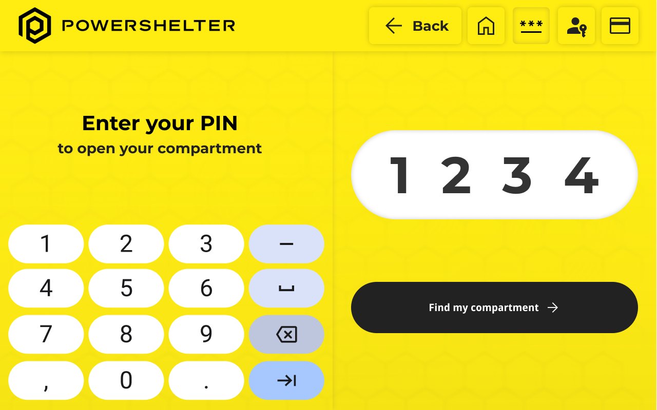
This is not a warm indoor kiosk. It lives outside, gets operated in the rain with wet fingers, by someone in a hurry. So the design leans on high-contrast yellow that reads in daylight, oversized touch targets that forgive wet or gloved fingers, a short flow with no small print, and a PIN pad big enough to hit on the first try.
The Work
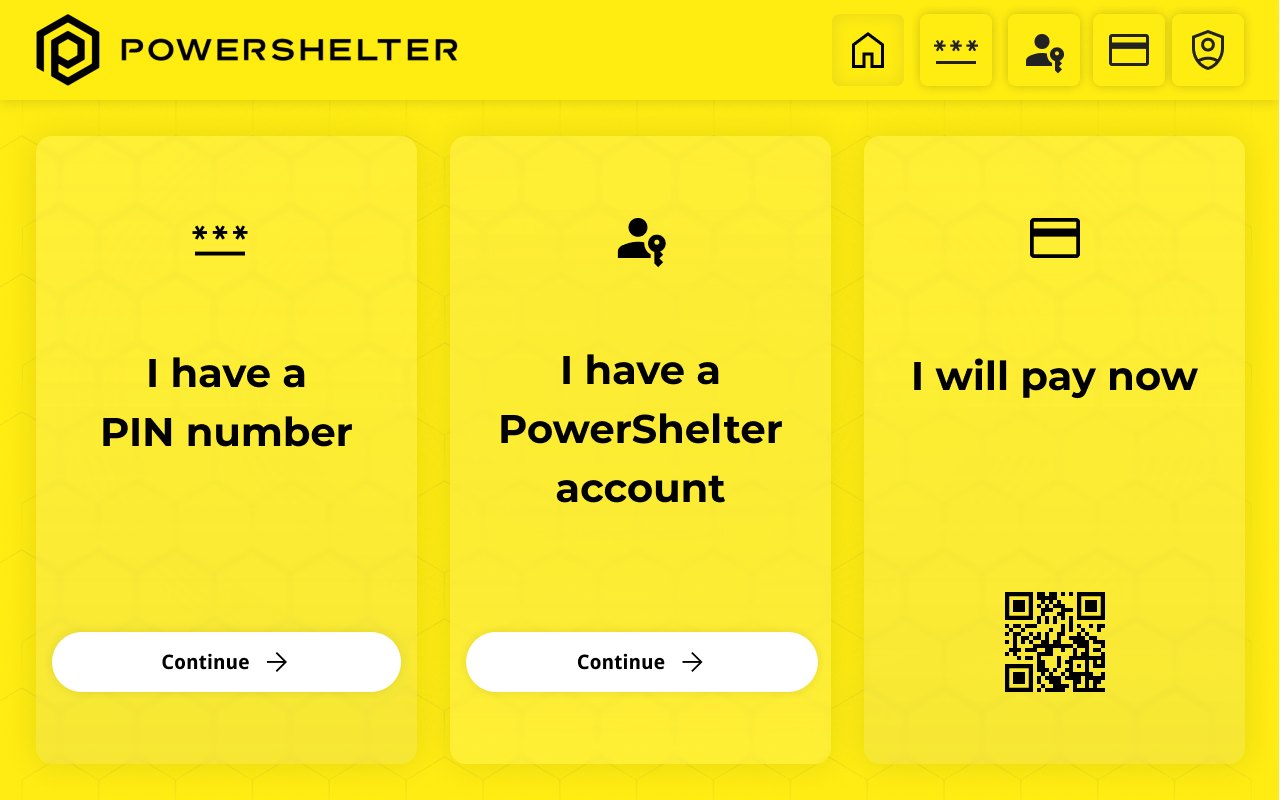
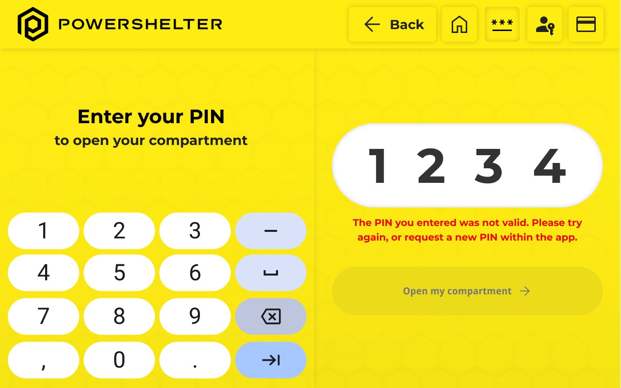
I designed the full unlock flow and built it as a working prototype: walk up, choose how to start (a PIN, a PowerShelter account, or pay on the spot), enter your code on an oversized keypad, and get assigned a compartment to open. The interactive version above is that flow, running the real screens.
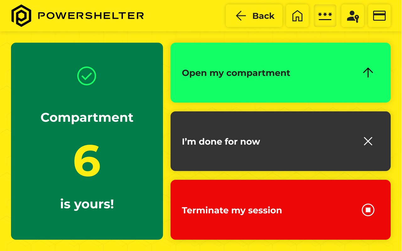
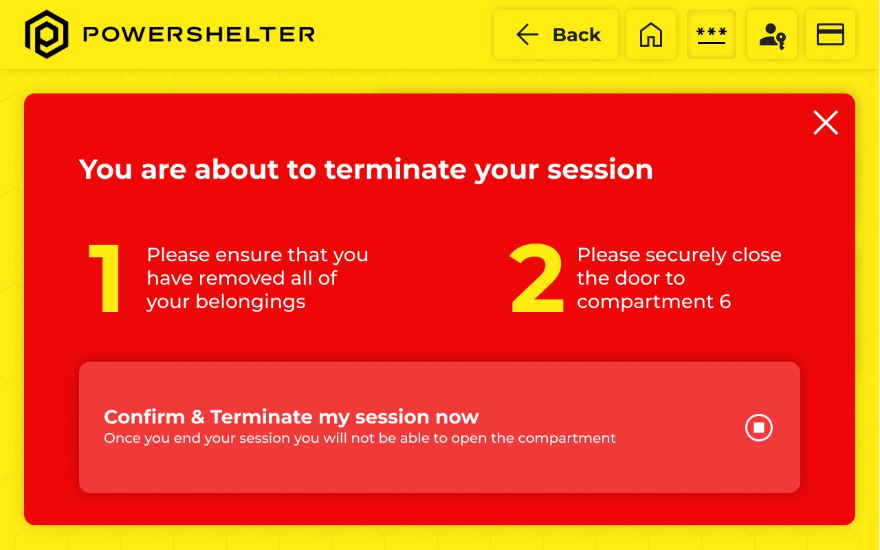
Every screen is built for the worst case, not the demo case. The keys are big enough to hit with a wet or gloved finger. The primary action is always the largest, highest-contrast target on the screen. States are never signaled by color alone: success reads "Compartment 6 is yours" with a check, ending a session carries a clear label and an explicit confirm, and an invalid PIN gets a plain-language message with a way forward. Nothing hides behind a small icon or a color you have to be able to see.
Why It Matters
Get the hardest moment right and the easy ones come free. A screen that works for a cold, wet, hurried hand in the rain works for everyone else without a second thought. That is the case for designing from the bottom of ability: the biggest, highest-contrast target is the one every user wants anyway, and a signal that never leans on color alone is one nobody can miss.
*Client engagement for PowerShelter BV, 2025.*
Design Gallery